Ubuntu Budgie 21.10 | Flexibility At Its Finest
For the past few weeks I’ve taken a bit of a break from my computer. As someone who covers Linux and open source software I’m often interacting with the Linux community to keep myself in the loop. During my break Ubuntu released its latest regular release of 21.10. Usually when there is a new Ubuntu release there is a lot of fanfare and talk about the distribution and its new features. This release however felt a little different. I didn’t hear or see much talk surrounding Ubuntu 21.10 from the usual outlets and community voices. After interacting with my own community when I prepared to get back to regular Linux coverage I noticed that the overwhelming reaction to this new release was more negative than positive.
My original plan was to cover the main Ubuntu version and then follow it up with all of the official flavours. But after checking out these releases I wasn’t enthused to continue with that plan. For me this round up of Ubuntu releases has been one of the most lacklustre Ubuntu releases in recent memory. The only saving grace was my favourite Ubuntu flavour Budgie did peak my interest after reading the release notes.
Ubuntu Budgie 21.10 is by no means the largest and most exciting update ever but it does at least offer a couple of interesting new features. So as per usual I geared a USB drive with the Budgie ISO which was around 3GB in size. The installation process is the same as in previous versions using the standard Ubuntu installer and was complete in under 10 minutes on my machine.
Upon booting up for the first time you’re greeted with the feature rich Ubuntu Budgie welcome screen. This will guide a new user through the first steps of setting up their new system. The welcome screen still remains one of my favourite welcome screens in any operating system. I went to update the system through the welcome screen which was when I was confronted with one of the changes in this release. Starting with 21.10 Ubuntu are transitioning their Firefox package over to the Snap format. This in itself isn’t the end of the world and there are legitimate benefits of this approach that you can read about . Unfortunately from the perspective of a new user this change could lead to some confusion. As the Snap isn’t included out of the box a user might launch the native version first and not think anything of it. It will boot up fast and inherit the correct desktop theme and integrate nicely with the rest of the system. Then when they update their system this will remove the native Firefox and replace it with the Snap without making it apparent exactly what’s happening. Then when that new user goes to launch Firefox once more they will notice the considerably longer time it takes to open and that the application theme doesn’t match the rest of the desktop. I’m sure this can all be easily addressed but from the perspective of that new user their web browser isn’t behaving as it once was and they don’t quite know why. This transition could have been handled a lot better. Fortunately the Ubuntu Budgie team have realised this and have published a post to explain how to switch back to the deb version which you can read .
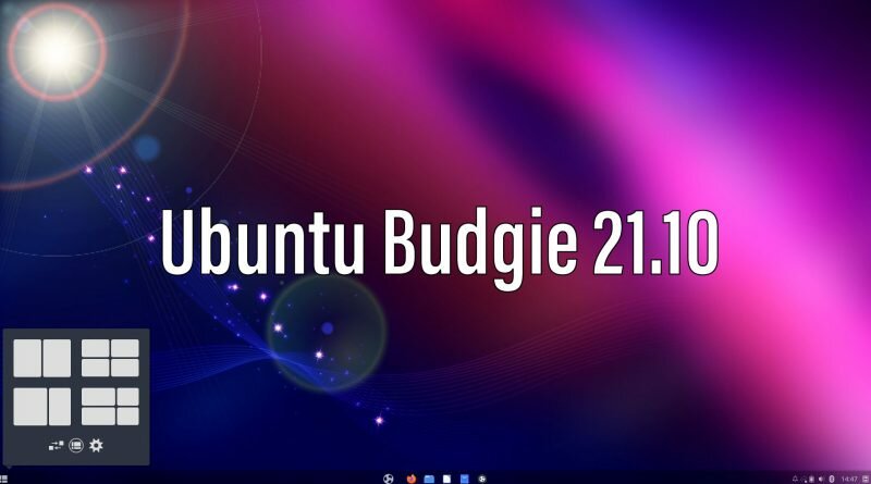
Now aside from that small minor issue everything else on Ubuntu Budgie 21.10 has been a seamless and enjoyable experience. The two main new features of this release are the improved window management system of Shuffle and the introduction of the Windows 11 like layout. Starting with the Shuffler it now has new auto tiling like features to organise your desktop windows in a way to utilize all of your screen space. It also comes with a new Shuffler applet that can live in one of your desktop panels. Hovering over the applet will allow you to select a number of different window layouts. It’s not too dissimilar to the new snapping features from Windows 11 which is where I assume they drew inspiration from. It’s a fun and handy little tool that will be better the more you use it. With further refinements and updates you could put it in the same sort of category that Pop Shell and Material Shell belong on GNOME.

As for the Windows 11 layout there isn’t too much to say here. In essence it will condense your dock and panel into a single panel at the bottom of your screen. It will change the application menu slightly to more closely mimic the Start menu on windows 11 and will centre your pinned applications. Combined with the new Windows Shuffler applet you have a nice new workflow to use with your Budgie system. This is one of the great things about Ubuntu Budgie, it’s flexible. It will adapt to your workflow instead of the other way around.
There are several other behind the scenes changes and quality of life improvements that you can read about here. All in all I’m happy with this new release of Ubuntu Budgie and it’s yet again the standout flavour of all of the official Ubuntu versions.
What do you think of Ubuntu Budgie 21.10? Let me know in the comments below!
